Chez Kolo — Little bits of Haïtian culture with flavor and fun all in the same package.
BRANDING
PACKAGE DESIGN
VISUAL LANGUAGE
WEBSITE DESIGN
CHALLENGE
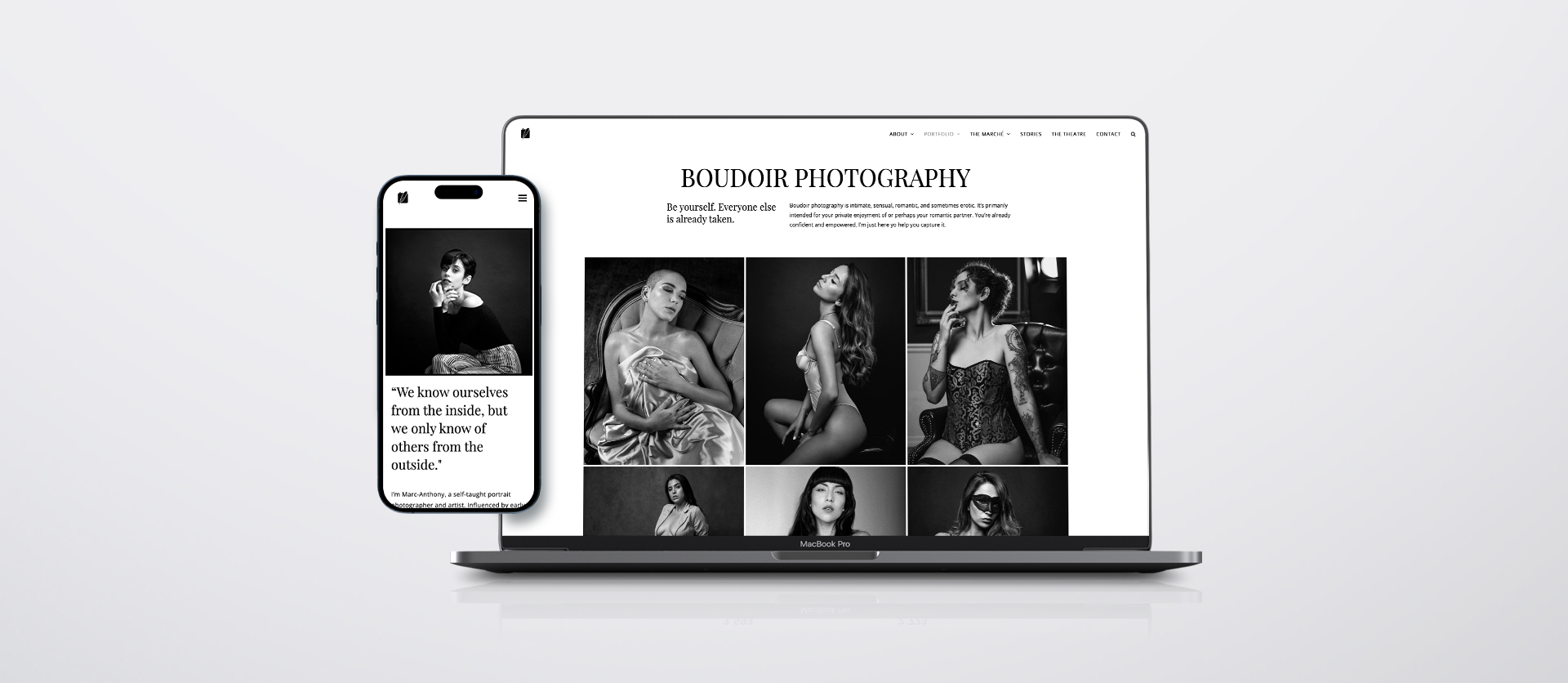
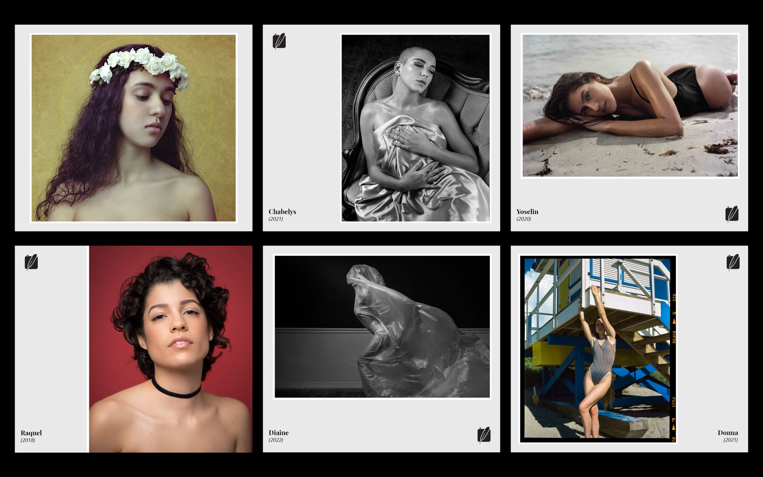
The primary challenge for an extensive collection of meticulously crafted photographs was to provide each image with a suitable platform. Achieving a harmonious blend of visual appeal and functionality required meticulous planning and attention to detail. In a fast-paced era of media consumption, predominantly favoring mobile devices, it was imperative for the photographs to swiftly establish a lasting impression.
APPROACH
I fostered a connection between visitors and the artist by integrating a minimalist design that accentuates the distinctiveness of each photograph. This approach prevents information overload while ingeniously presenting the artwork through simple yet creative means.
BRAND IDENTITY
Simplicity is the key to brilliant design.
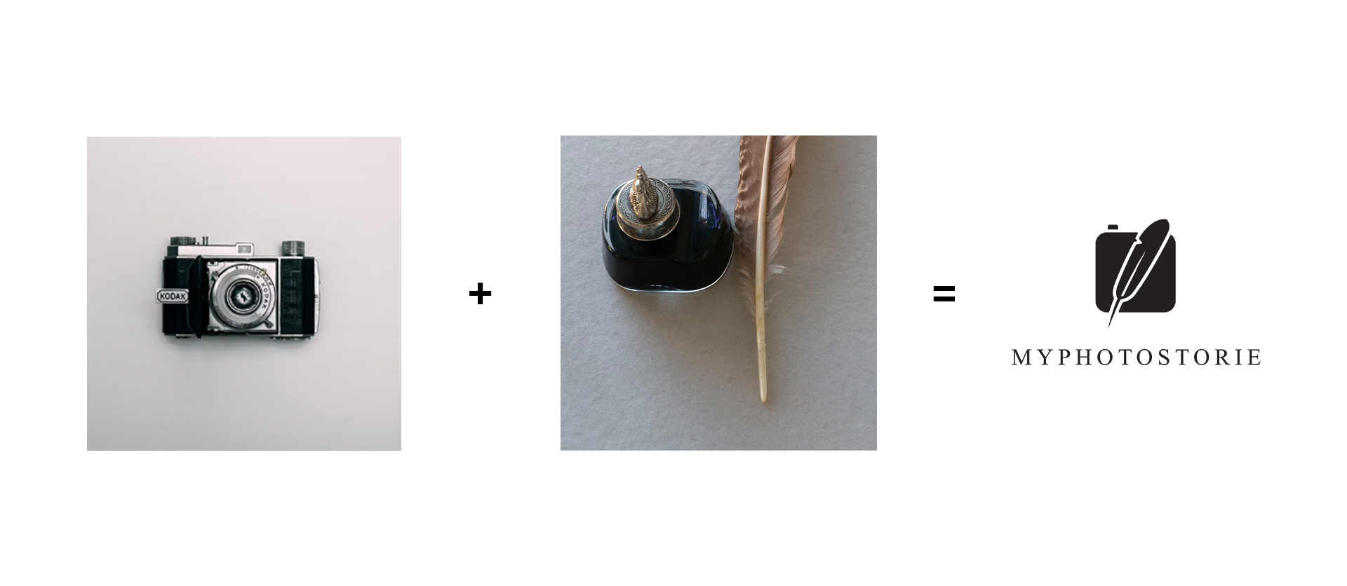
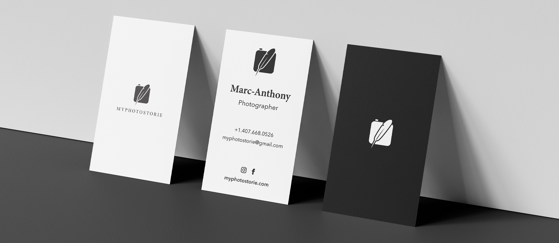
Crafting an elegant and effective design is a well-established challenge that demands not only experience but also a meticulous commitment to detail and hard work. Myphotostorie stands out by its dedicated pursuit of both pure artistic expression and precise technical execution. Given the brand’s focus on storytelling, the logo was conceived with functionality, simplicity, and a direct approach in mind.

TELL A VISUAL STORY
A minimalistic and sophisticated design that allows the photographs to shine.
It’s fairly known that elegant and effective design does not come easy. Besides experience, it takes hard work and attention to detail. All that dedication to pure artistic expression and technical execution is what makes Myphotostorie truly unique.
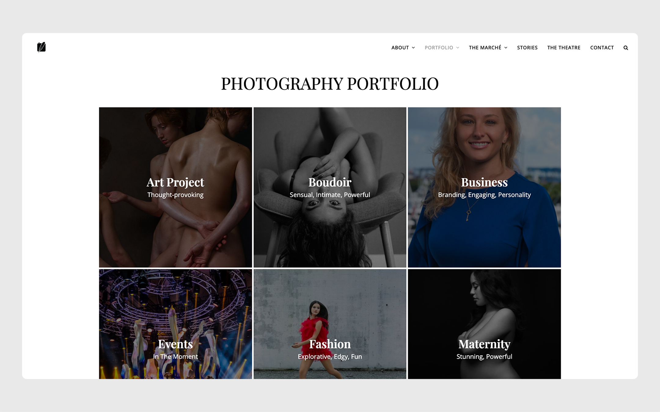
Simple & effective categorization
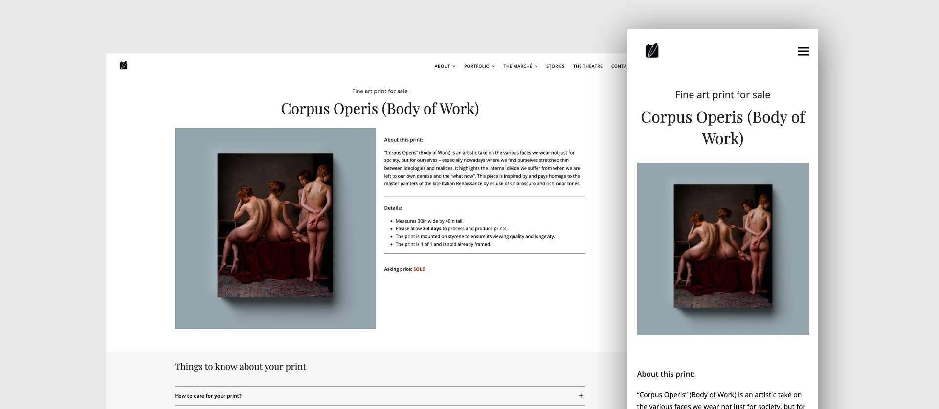
I implemented a straightforward layout system to facilitate users in swiftly exploring and locating their areas of interest. This was complemented by the integration of a bold and refined serif font, strategically chosen to evoke a sense of confidence in the brand.
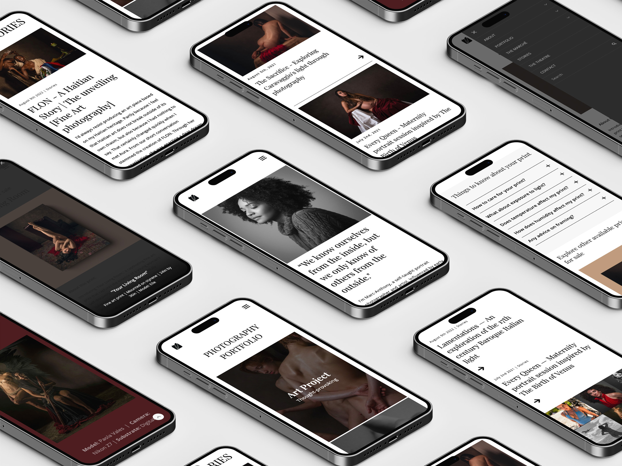
Clean & impactful mobile experience
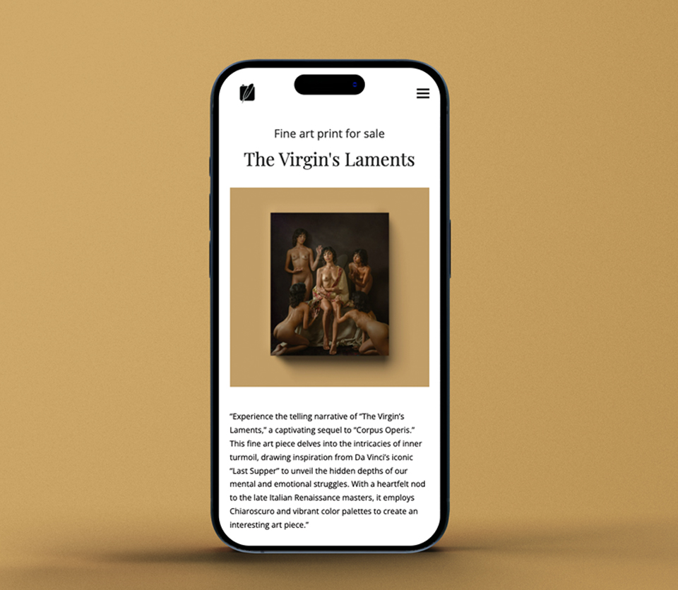
With consideration for attention spans, my strategy involved prioritizing visual storytelling through a primary focus on images, complemented by robust typography to reinforce the narrative. The vibrant hues within the photographs served as a deliberate departure from the minimalistic backdrop, enhancing the overall visual impact.
BE PART OF THE ART
Sort of like the Louvre, but in your palm.
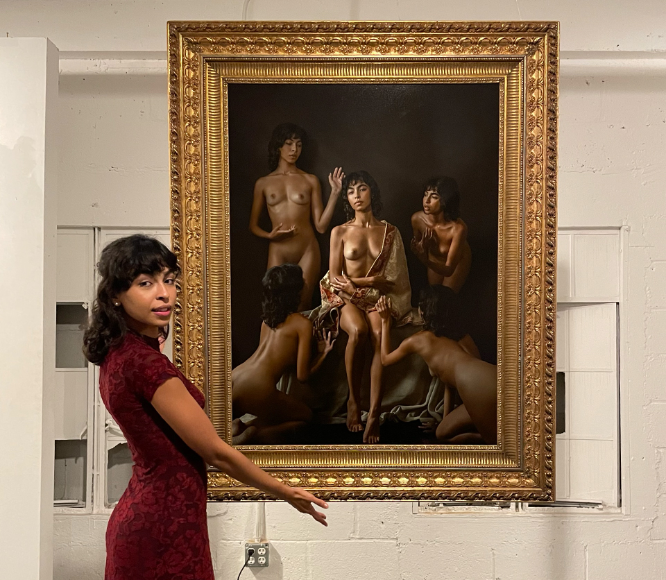
JUST THE VIEWER & THE ART
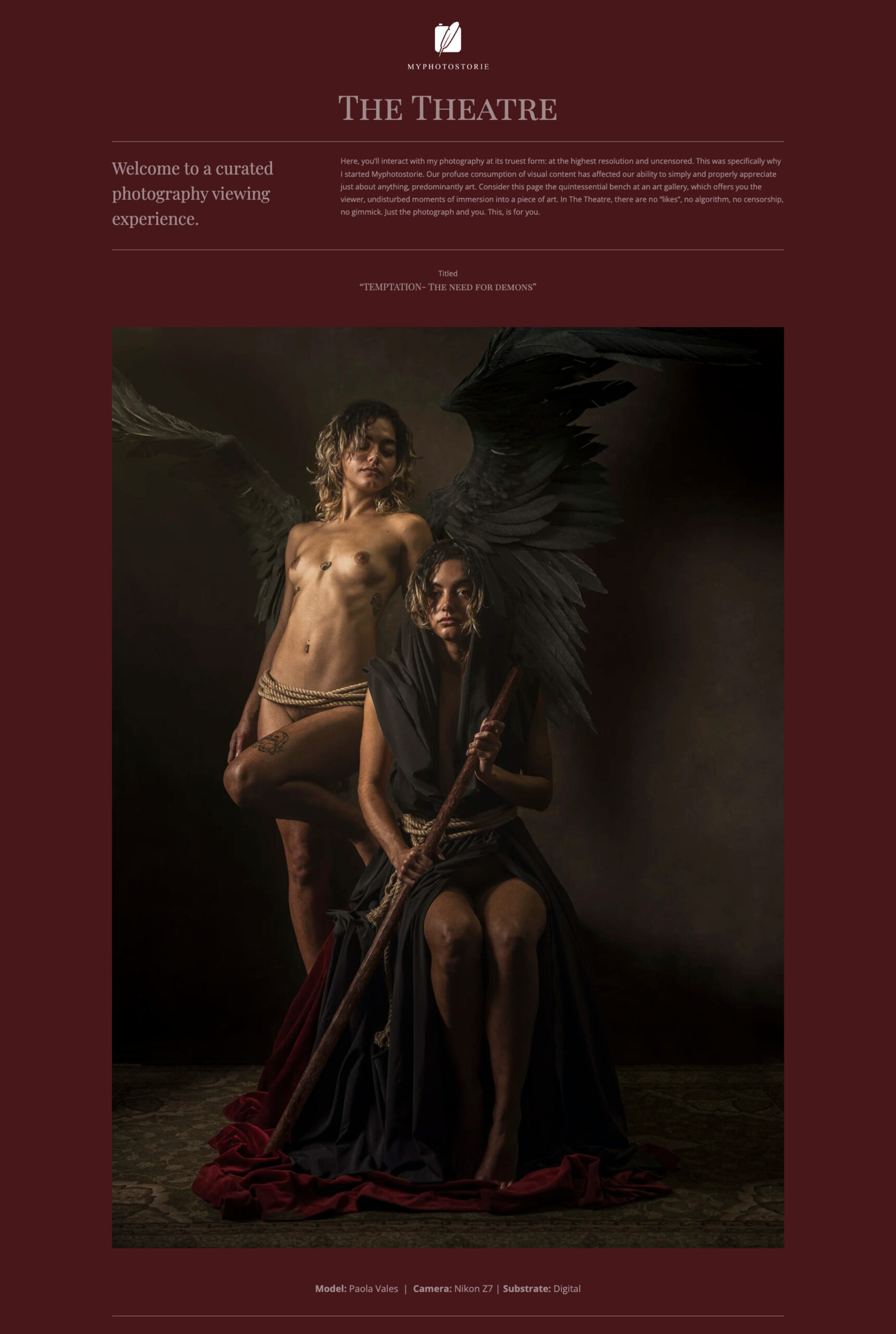
While social media – when used well – is a fantastic tool for businesses, it inherently fails the enjoyment of art. The now-known profuse consumption of visual content has affected our ability to simply and properly appreciate the intricacies and details. The Theatre was created to be the quintessential bench at the art gallery that offers the sense of undisturbed moments of immersion. In the Theatre, there are no likes, no comments, no censorship, just the artwork and the viewer.
RESULTS
INCREASE IN CLIENT BOOKINGS.
40%
INCREASE IN PRINT PURCHASES.
25%
